Pantone is a website I have often visited recently. The first feeling of entering the website is the impact of rich colours. We all know that Pantone is a world-famous authority specializing in developing and researching colour. Therefore, it expresses the theme of colour through the precise use of colourful pictures and different coloured fonts.
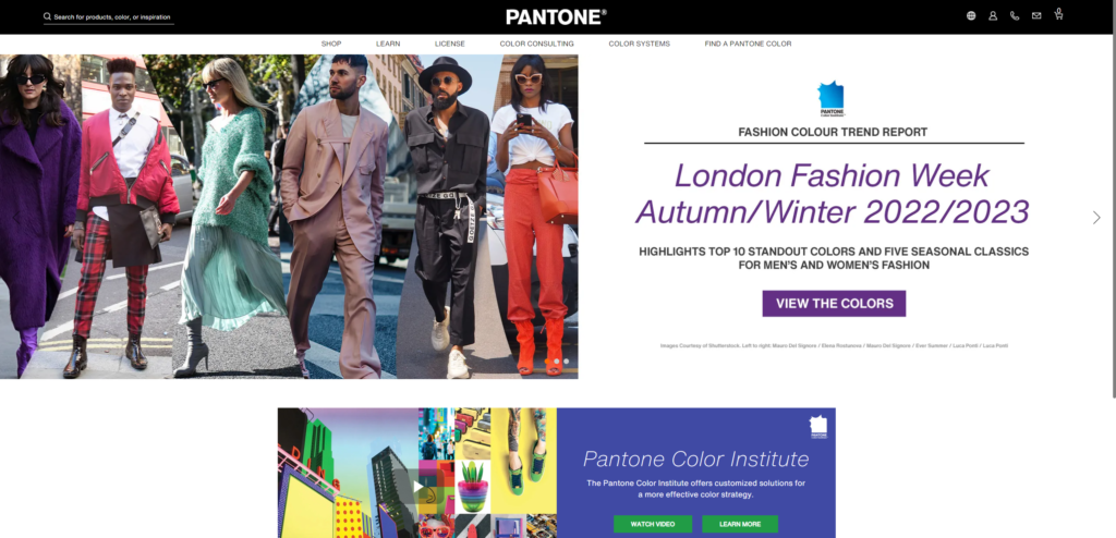
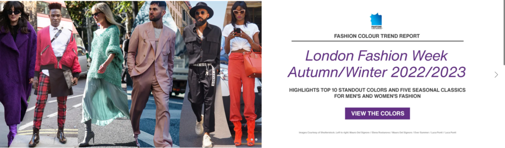
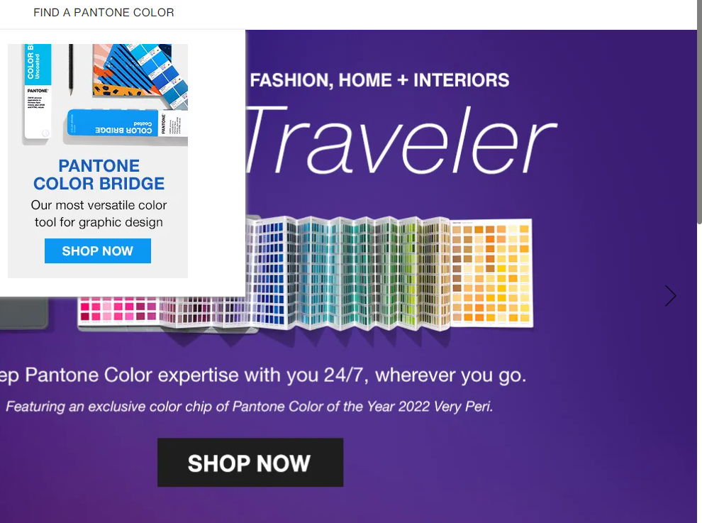
Travis Gertz believes that the cover gives us a hint of what is inside, combs our emotions and implores us to read the rest. The home page is the cover of a website. I think Pantone’s featured slider design achieves this. From the screenshot below, we can notice that Pantone’s feature slider adopts a left-right layout design, in which the pictures accurately express the main content of the article. This allows readers to get the information of future colour trends just through the primary colours of the six characters in the picture without clicking on the article to read.
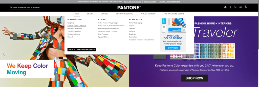
Next, let us focus on more specific and detailed design elements. Victor Kaptelinin said that good design is intuitive, and intuitive design allows us to use it correctly without thinking. Therefore, I think web design should follow the basic principle of easy browsing and easy access. At the same time, make sure that visitors always know their exact location on the website and can easily access the location they want. Therefore, straightforward and easy to operate navigation is the most essential and vital design element in web design. And the screenshot below shows that Pantone’s navigation is located at the top of the page. Its navigation is divided into six main menus according to different contents and information.
Moreover, each menu is an interactive drop-down menu to provide more links. The expanded menu concisely shows several significant categories of main topics and shows specific commodity segmentation. Although the drop-down menu contains many options, after clear stratigraphic division and typesetting, the information is accessible for users to understand, and the overall design is concise, clean and fashionable.
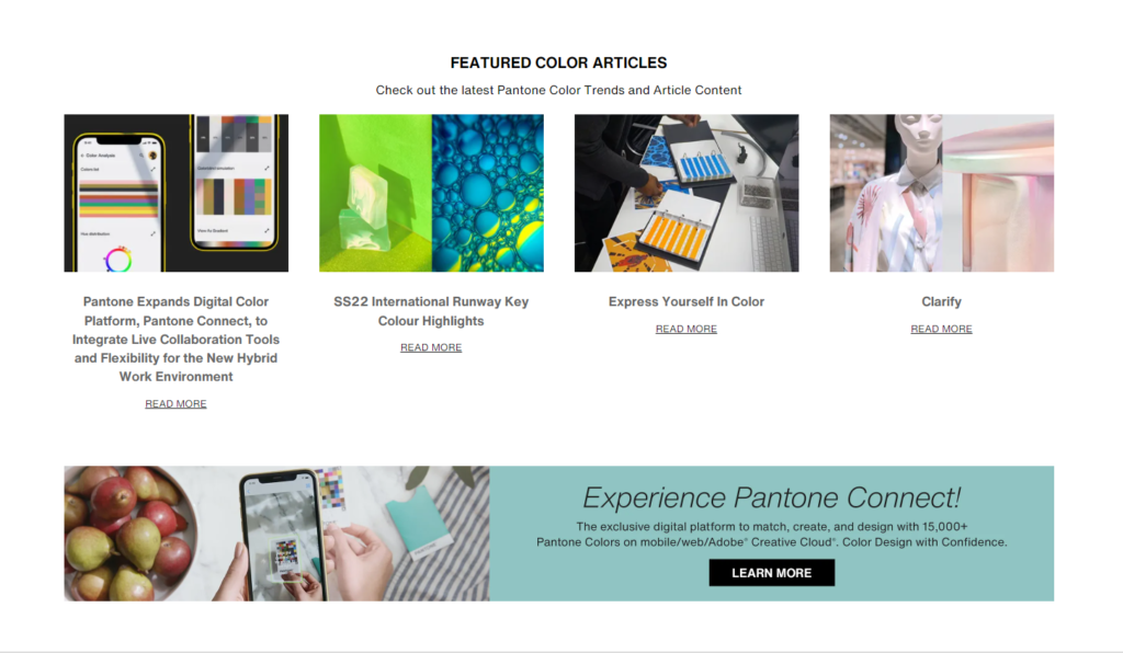
The last thing I want to talk about is Pantone’s call to action design. A call to action is a simple way for visitors to take the next step on the website. From “read more” to “social media sharing button” can actively mobilize people’s participation. We can catch many interactive buttons to promote people’s participation in Pantone’s main interface. They are composed of rectangles of different colours and sizes, which attract users’ attention. Furthermore, provide clear guidance to users through concise words such as “read more” and “learn more.”
Gertz, T. (2015, July 10). How to survive the Digital apocalypse. Louder Than Ten. Retrieved February 20, 2022, from https://louderthanten.com/coax/design-machines
Kaptelinin, V. (n.d.). Affordances. The Interaction Design Foundation. Retrieved February 20, 2022, from https://www.interaction-design.org/literature/book/the-encyclopedia-of-human-computer-interaction-2nd-ed/affordances


