This week, I will be doing my second peer review, this time on the blog She Is Recovering.” I will be writing this post directed to Alessia who is the owner of this blog!
Hi Alessia!
Your website theme is novel and attractive. Each of us should face up to our mental health. As you said,everyone has a right to feel their best. Therefore, when I know the theme of your website, I cannot wait to browse your website. Your “Need Support” interface is vibrant. I learned that so many apps could provide mental health help by browsing the interface.
After a rough reading of each of your posts and a particular understanding of your blog content, I want to back to our topic today: Design.
I will give you my thoughts and suggestions from these four parts: Layout, Colour, Illustrations and Design Details.
Layout
Home page
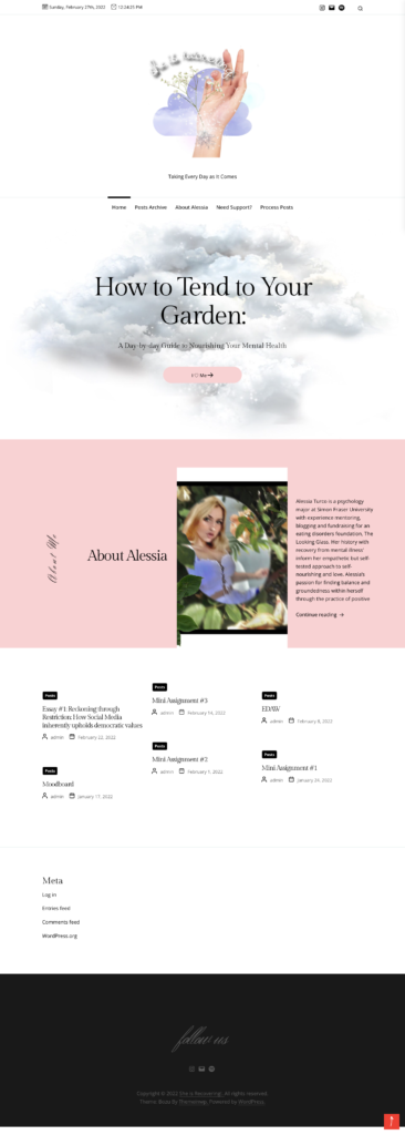
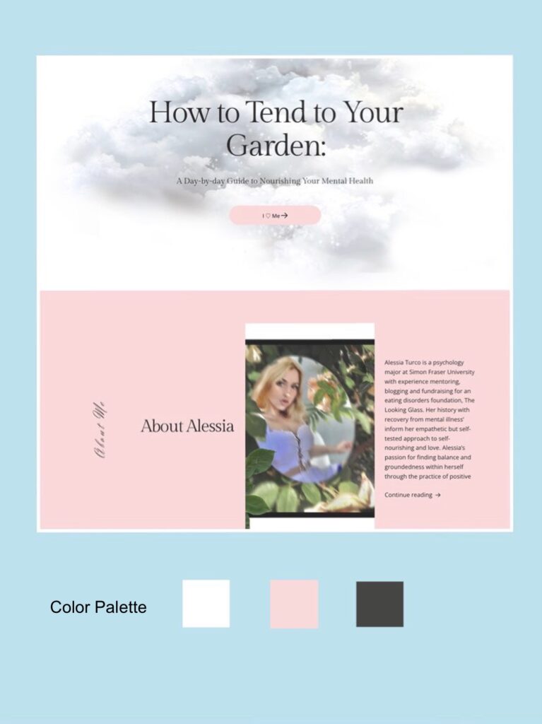
I think the overall design of your home page is very consistent with your theme. I felt the simplicity and soft aesthetics you used in the design when I entered your home page. This layout gives me a feeling of cleanness and calm. After scrolling up and down your homepage, I found that your homepage is mainly divided into four sections: Header Image, Menu, About and Post List.
The layout of these four parts clearly presented the information and achieved a strong visual impact effect through exquisite pictures and interactive animation effects, which left a deep impression on me.
However, I still have some suggestions for you:
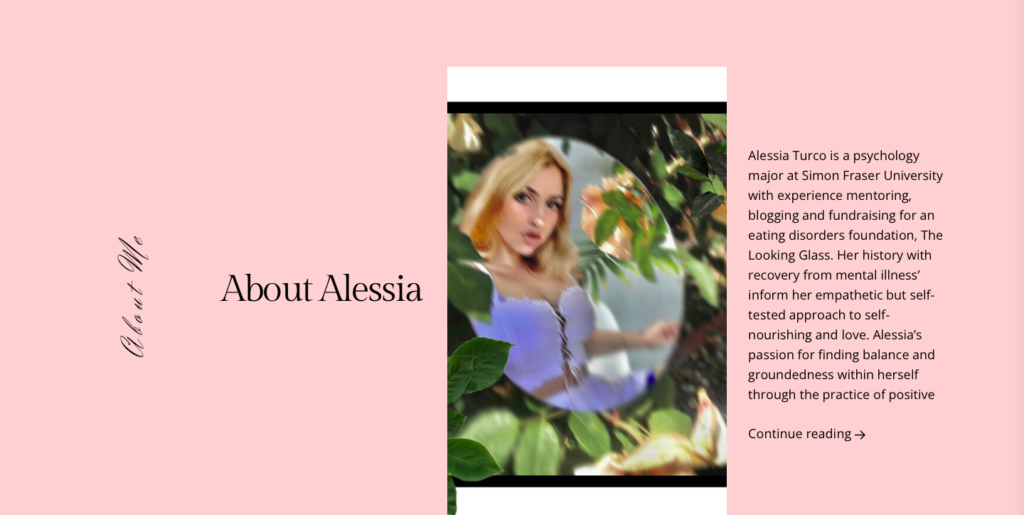
First of all, your “About” is too crowded, and there is too much blank space on the left side of the picture. The main reason for this situation is that there are two titles of the plate on the left, one is “about me” in a handwritten font, and the other is “About Alessia” with an interactive function 👇
I suggest keeping only one title and increasing the gap between photo and text to make the plate more visually balanced.
Post page
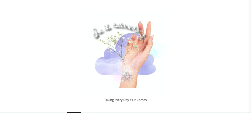
When reading your Process Posts section, your overall layout makes me feel like I’m browsing your diary. There are not too many design elements in this part. This layout is straightforward. However, it is better to add the title or pictures to give readers some critical information at a glance.
Colour
After browsing your website, I found that the colours of your website focus on white, black and pink. Combining these three colours shows a soft visual effect, which I think is in line with your website theme.
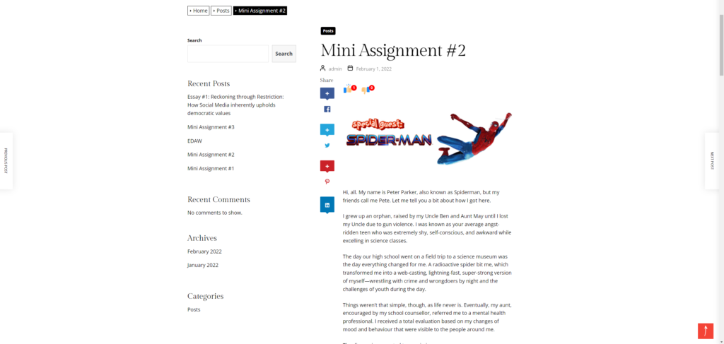
I noticed that there are many interactive buttons in your post interface, which is a great design. Because these interactive designs can help readers quickly jump to the different interfaces they want to go to. At the same time, I also found that there are many interactive designs to interact with readers on your website. For example, there will be a social media sharing button on the left of each article. These designs can well stimulate the participation of readers.
Generally, your website design style is very appropriate to your theme, and I appreciate your warm design elements very much! I can’t wait to see how your blog evolves and what more content you create!