Process Post #5
As an editor
After a detailed description of my target audience last week, I will perform my editorial duties according to my target audience this week.
Many people do not know what editors do. Maxwell Perkins believes that an editor is just a writer’s handmaiden and will not contribute to a book (Week 5 Lecture).
In my opinion, editors improve the quality of communication with the target audience through modification and adjustment.
The font is a critical factor in determining the quality of communication with the audience. So this week, I focus on the responsibility of copyediting adjusting the font and layout of the blog.
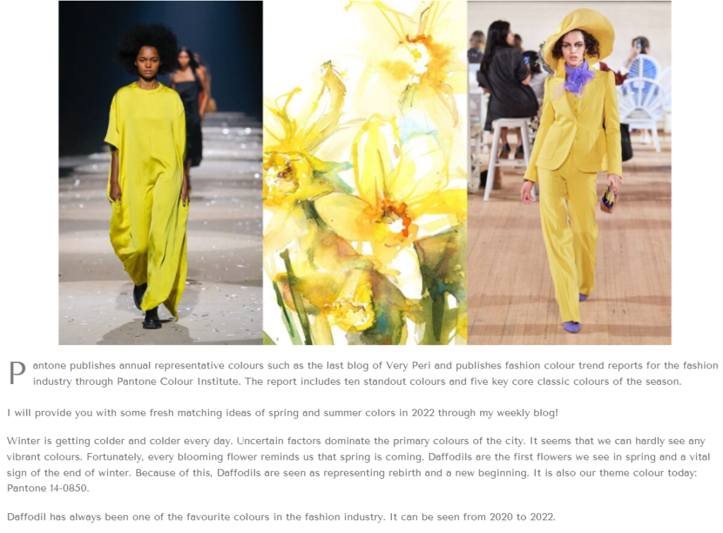
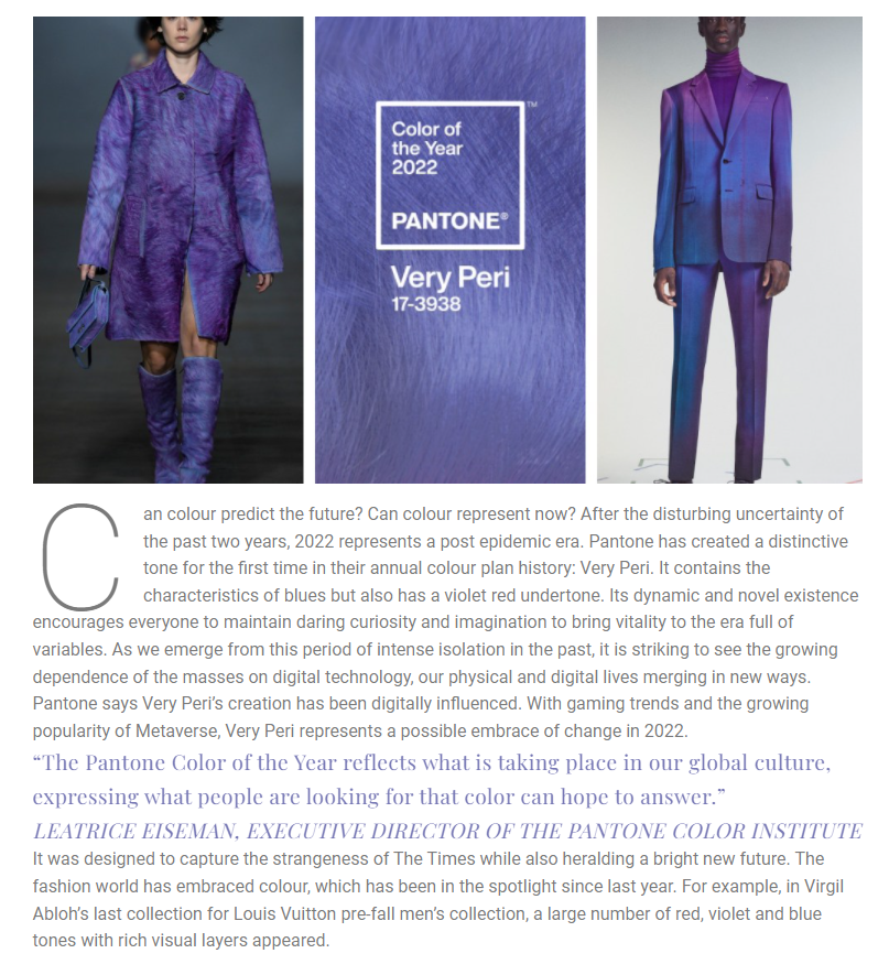
As can be seen from my first blog (below), I chose the same font to complete the content writing of the whole blog. In this whole paragraph, I just changed the font size and colour. This makes it easy for readers to have reading fatigue and lose interest in reading which significantly affecting the reading experience.
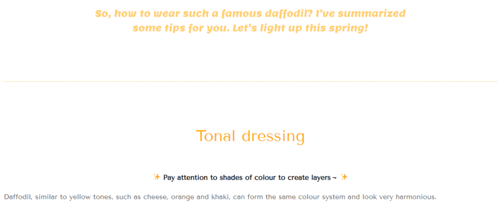
In order to alleviate readers’ reading fatigue, I first reorganize a whole paragraph. This reduces the reading burden of readers and creates a blog atmosphere of face-to-face communication with readers. Because such multi-paragraph grouping is more like a form of dialogue when readers read, they will not feel that they are facing strange words and cold screens, but more that I am talking to them.

Then, by changing the font colour, I emphasized the content and the subtitle to help readers quickly grasp the key points and contents of the reading.

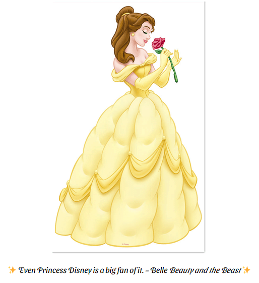
Compared with the whole previous blog using the same font, I also try to select the corresponding font type according to different contents and pictures in the blog. For example, I chose the cartoon font with Disney Princess Belle in the figure below 👇
The above is my current adjustment. During the reading break, I will adjust the content format, font and other forms of all blogs, including text proofreading and photo research.


You May Also Like

Process Post #8
March 20, 2022
Process Post #1
January 18, 2022

