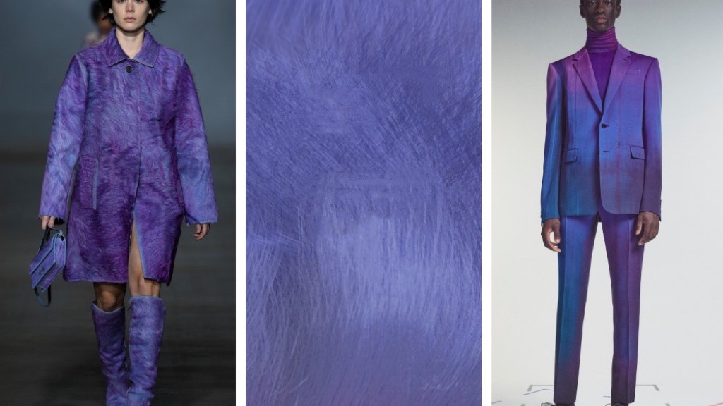
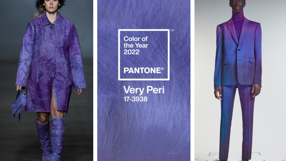
Blog,  RainbowWay

PANTONE 17-3938

How to wear Very Peri?

Image by Rivet via Sourcing Journal

Can colour predict the future? Can colour represent now? After the disturbing uncertainty of the past two years, 2022 represents a post epidemic era. Pantone has created a distinctive tone for the first time in their annual colour plan history: Very Peri. It contains the characteristics of blues but also has a violet red undertone. Its dynamic and novel existence encourages everyone to maintain daring curiosity and imagination to bring vitality to the era full of variables. As we emerge from this period of intense isolation in the past, it is striking to see the growing dependence of the masses on digital technology, our physical and digital lives merging in new ways. Pantone says Very Peri’s creation has been digitally influenced. With gaming trends and the growing popularity of Metaverse, Very Peri represents a possible embrace of change in 2022.

“The Pantone Color of the Year reflects what is taking place in our global culture, expressing what people are looking for that color can hope to answer.” 

LEATRICE EISEMAN, EXECUTIVE DIRECTOR OF THE PANTONE COLOR INSTITUTE

It was designed to capture the strangeness of The Times while also heralding a bright new future. The fashion world has embraced colour, which has been in the spotlight since last year. For example, in Virgil Abloh’s last collection for Louis Vuitton pre-fall men’s collection, a large number of red, violet and blue tones with rich visual layers appeared.

“Virgil was definitely here: Busting convention and sparking change.”

NICOLE PHELPS

And Vintage Versace has worn by Zendaya at the BET Awards, Anya Taylor-Joy in Oscar, and Lady Gaga in Gucci at the “House of Gucci” London premiere wearing a violet purple gown from the Gucci Love Parade collection.

The complexity of the hue of Very Peri makes the modelling release a strong sense of atmosphere, which seems to emphasize who will be the new favourite in the fashion circle next year.

So, how to wear Very Peri?

Very Very Peri

Wearing a matching colour of the outfit is almost used with any colour. Monochromatic dressing can make use of the difference of colour depth, saturation and lightness to make the wearing more layered 👇

Very peri is no exception. Wearing an entire outfit in the same colour is the simplest: it looks playful and cute👇

Very Peri+White

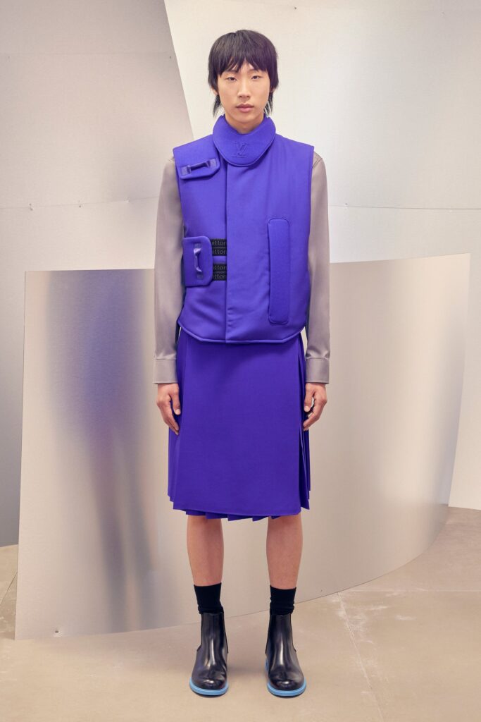
White as a versatile transition colour with Very Peri together immediately show a refreshing feeling👇

Very Peri+Macaroon

Very Peri is a cold colour palette, but it fits well with many bright and colourful macarons. For example, goose yellow with Very Peri is very eye-catching👇

Macaron pink and Very Peri are also the best matches, emitting a sweet feeling👇

This is all the sharing of Very Peri today. In the next blog, I will share some fashion pieces of Very Peri.

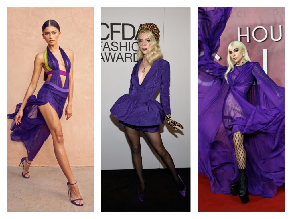
Have Very Peri outfit ideas of you own? Share them with us in the comment section below 👇

One Comment

Leave a Reply

Your email address will not be published. Required fields are marked *

css.php